The K-line chart originated in the Tokugawa Shogunate Era in Japan and was invented by the Japanese Honma Munehisa. It was first used to record the rice market. It was introduced to the Western world by the famous American expert Steve Nissen in a book called “Japanese Candle Chart Technology”. The theory was widely used by the financial market in the 20th century.
The K-line chart is drawn in series through the candle charts formed by the opening price, closing price, highest price and lowest price. According to its different structural shapes, the K-line is divided into different concepts such as solid line, negative line, positive line, upper shadow line, and lower shadow line.

Through the K-line chart, we can intuitively see the strength of the underlying trend. The power difference between buyers and sellers. We can also predict the market outlook through the K-line.
Understanding the K-line
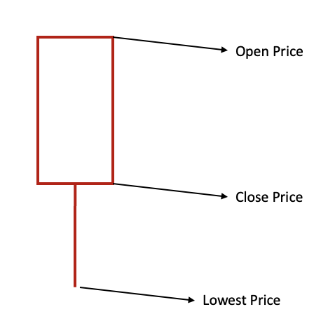
Each candlestick represents a period of trading time based on your set timeframe (One day, one hour or one minute). A red candle indicates that the closing price is lower than the opening price which translates to a decrease in asset price. A green candle indicates that the closing price is higher than the opening price, signifying an increase in asset price. Investors can use the candlestick chart to deduce the short-term and long-term market trends.
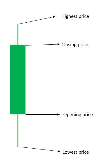
Candlesticks consist of candle bodies and upper and lower shadows. The candle body represents the transaction, and the shadow represents the price.
Pros and Cons of using candlestick pattern
Pros: each candlestick is essentially a record of the price change in a given time period. The formation of a candlestick negates the noise with the time period. By referring to the K-line chart, novice investors can develop more robust short- and mid-term trading strategies.
Cons: The candlestick chart technology was created in the early 20th century and the development was not very mature. The process of drawing K-line charts is complicated, especially in times of high market volatility, and the selection of points and the formation of K-line charts are complex. Therefore, the technical analysis strategies of K-line charts are still being further developed.
K-line usage example
The line above the candle body is the upper shadow, and the line below the candle body is the lower shadow. The combination of different shadow lines and the length of the body can reflect the different trading conditions of the market.

- Spinning top (Isometric upper and lower shadows): Such a K-line pattern means the market has an upward trend, however, due to the small actual trading volume, there is a lack of price negotiation space between the highest price and the lowest price. In our daily trading process, no price negotiation means that there is no more room for speculation. This directly shows that the market lacks the power to rise or fall, and the market is generally undergoing consolidation at this time.

- Inverted Hammer: The opening price is equal to the lowest price, which usually appears on the floor of a downtrend, and the selling power is exhausted. This may be signs of a rebound in the future trend.
Such a pattern also means that for the majority of market participants, the low point has been reached, and a consensus has appeared.
- Hammer: At this time, there is still room for a further decline in asset prices in the future. This pattern means that the market is further testing the price, the buyer and the seller are playing a game on the price, and the buyer at this time undoubtedly has the initiative. If the test is successful, then the next candle should be a rising candle with a short upper shadow (representing sellers trying to keep the current price) or a falling candle with a long lower shadow (meaning that buyers are not satisfied with the current price, and the price may go up).

- Doji Candlestick: Doji Candlestick is a special K-line form in which the closing price and the opening price are at the same price or similar.
The appearance of the Doji candlestick is a symbol of the stagnation of volume and price. Therefore, when the Doji candlestick is at the bottom, it means that the long-term downturn market is coming to an end, and it may enter an uptrend, which is called “the star of hope”. And when the Doji candlestick appears at a higher price at the top of the market, it means that the upward momentum has stalled and it may enter a downtrend.

- Engulfing Candlestick: In the upward market, it means that the opening price is the lowest price, and then it goes all the way up, and the market has no objection to the price; In the downward market, it means that the opening price is the highest price, and the market does not have any rescue measures for the downward trend.
Conclusion
There are not many basic patterns of K-line, but there are many market signals formed by two or more candles, and the market meaning formed by each pattern is different. Using various patterns such as the spinning top, three white soldiers, three black crows, morning star, engulfing patterns and many more, investors can formulate a stronger investment strategy according to the different K-line patterns.
For the novice investor, it is most important to start with the most basic K-line knowledge in order to accurately understand the market.
Join MEXC and Start Trading Today!


